Field note
Marketers: Build Google Display Ad Templates in Mins With Assets.dev
Generate a full Google ready display ad asset matrix in minutes. A template first workflow and Assets.dev automate crops, logos, and specs so you can...
Pick a customizable template and export it as a full set of assets, not one finished banner. Google's responsive display system needs horizontal, square, and portrait images (all under 5,120 KB) plus square and wide logos, and it recombines them automatically. Assets.dev can generate that whole matrix in brand colors in minutes instead of hours.
TL;DR:
- Using at least three to four well-sized images per ad group maximizes Google's testing and optimization potential.
- Export each aspect ratio and logo format separately to prevent auto-cropping and maintain visual integrity across placements.
- Keep headlines under 80 characters, use high-contrast colors, and avoid overlay text to ensure readability at small sizes.
- Automating brand-specific color, font, and logo application with assets.dev reduces manual effort and keeps branding consistent.
- Most campaigns do not require HTML5 templates, as static images sufficiently cover the majority of responsive display inventory.
Table of Contents
- Where to Find Google Display Ad Templates
- Google Ads Image Specs and Asset Requirements
- What Makes a Display Ad Template Actually Work
- How to Turn a Template Into a Live Responsive Display Ad
- Template Preflight Checklist Before You Upload
- Adapting Templates for Different Campaign Goals and Audiences
- Keeping Brand Identity Consistent Across Every Template
- Common Mistakes That Sink a Template-Based Campaign
- Publisher Perspective: How Assets.dev Fits a Template-First Workflow
- Get Your Template Matrix Built in Minutes, Not an Afternoon
- Sources
- FAQ
Where to Find Google Display Ad Templates
Three sources dominate this space, and each trades speed for control differently. A curated template library gets you a finished, tested layout in minutes but limits how far you can push the design. A general design tool (Figma, Photoshop, Sketch) gives full creative control but means building every aspect ratio from scratch. A generation platform like assets.dev sits between the two: it starts from a vetted template and adapts it to your brand automatically, so you skip both the blank canvas and the rigid layout.
What matters more than the source is the file format you end up with. Most designers work in editable source files, Figma boards, PSD layers, or Sketch documents, then export flattened images for upload. Google Ads accepts JPG and PNG for image assets, while Ads Creative Studio supports HTML5 templates built in Google Web Designer for richer, animated formats.
Choosing between the two comes down to your creative goal:
- Image templates work best for fast iteration, A/B testing, and campaigns run by a small team.
- HTML5 templates fit brands that need motion, interactive elements, or swappable variants across dozens of placements.
- A hybrid approach, static images for most placements plus one HTML5 hero unit, covers the widest inventory without overbuilding.
Most small business campaigns never need HTML5. Static images, properly sized, cover the vast majority of responsive display inventory.
Google Ads Image Specs and Asset Requirements
Responsive display ads run across more than 3 million websites and 650,000 apps, and Google's system builds each impression from the assets you upload rather than a fixed creative. That means precision on specs matters more than it would for a single static banner. Get a ratio or file size wrong and the asset either gets rejected or silently drops out of rotation.
Google's system accepts up to 15 images across those three aspect groups, and it uses more assets to test more combinations, not to pad out your ad group. Uploading only one horizontal image and calling it done is the single most common way marketers underuse the format.
Disapprovals usually trace back to the same handful of causes: images that exceed 5,120 KB, logos submitted at the wrong ratio, text baked directly into an image (Google reads this as low-quality creative), or landing pages that don't match the ad's claim. Check file size and ratio before upload, every time, even when you're reusing a template that worked last quarter.
What Makes a Display Ad Template Actually Work
A template earns its place in your workflow only if it survives being resized, recolored, and cropped a dozen different ways. Four elements carry every effective display ad, regardless of industry: a clear logo, one strong hero image, a value proposition stated in a handful of words, and a single call to action. Add a second CTA or a competing headline and you dilute both.
High-contrast, focused designs consistently outperform busy or collage-style layouts, which lines up with the KISS principle that governs most professional ad design: simple copy, one focal point, nothing fighting for attention. Display ads run at tiny sizes on crowded pages, so anything that requires a second look to parse gets scrolled past.
A few rules keep templates legible at scale:
- Keep headlines at 80 characters or fewer, and write them in sentence case, not all caps.
- Use two, maybe three brand colors with strong contrast between text and background.
- Never overlay dense paragraphs of text on a photo; let the hero image breathe.
- Offset your focal subject rather than centering it, since different aspect ratios crop differently.
- Supply 3 to 4 distinct assets per ad group so Google's optimization engine has real variation to test.
If the headline or logo becomes hard to read at that size, it will fail on a mobile phone in someone's crowded feed.*
The Moor Marketing team's breakdown of ad creatives that convert makes the same point from a different angle: the creative elements that drive clicks are rarely the flashiest ones. They're the clearest.
How to Turn a Template Into a Live Responsive Display Ad
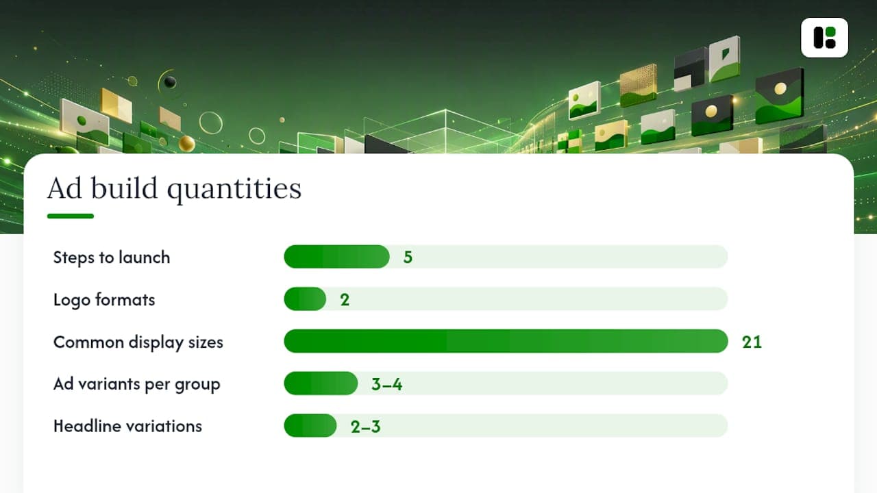
Getting from a downloaded template to an approved, running ad takes five steps, and skipping any one of them is where most disapprovals happen.
- Export every aspect ratio separately. Don't let one master image be auto-cropped by the ad platform. Manually export horizontal, square, and portrait versions so your composition and CTA stay intact in each.
- Build both logo formats. You need a 1:1 square logo and a 4:1 landscape logo, each under 5,120 KB, matched to your brand's actual color values.
- Write short copy assets. Draft two or three headline variations under 80 characters and a couple of description lines, since Google tests combinations rather than a single fixed pairing.
- Upload into Ads Creative Studio or Google Ads directly. Ads Creative Studio's template library covers 21 common display sizes and lets you preview how each size renders before it goes live. If you're using swappable template elements, configure those variants here.
- Launch 3 to 4 ad variants per ad group and let the campaign run at low spend for a few days before judging performance.
That fifth step matters more than it sounds. Google's own guidance points to 3 to 4 ads per ad group as the sweet spot, enough variation for the algorithm to find a winning combination without spreading your budget too thin to get a real read.
Display ads on this network average a click-through rate around 0.46%, a number that puts creative quality, not just targeting, squarely in your control as the lever most worth pulling.
Template Preflight Checklist Before You Upload
Run through this list before every upload, not just the first time. Specs get missed most often on the second or third campaign, once the process starts feeling routine.
- File sizes under 5,120 KB for every image and logo
- Horizontal (1.91:1), square (1:1), and portrait (9:16) ratios all present
- Square (1:1) and landscape (4:1) logo versions both included
- No text baked into images, no collage or composite backgrounds
- Headlines at 80 characters or fewer, written in sentence case
- Landing page content matches the ad's claim and CTA
- At least three distinct images per ad group, plus a short video if you have one
| Check | Why it matters |
|---|---|
| Aspect ratio accuracy | Wrong ratios get rejected or excluded from placements |
| File size under cap | Oversized files fail upload entirely |
| Text-free imagery | Overlaid text is a common disapproval trigger |
| 3+ images per group | Gives Google's system enough variation to optimize |
| Video included | Adding video alongside images can improve ad strength |
Once a template clears this list, save it as your baseline. Future campaigns become a matter of swapping copy and hero images, not rebuilding specs from zero.
Adapting Templates for Different Campaign Goals and Audiences
A template built for brand awareness and one built for direct response shouldn't look the same, even if they share a logo and color palette. Awareness campaigns lean on the hero image doing most of the work: a strong photo or illustration with a short, memorable value statement and a low-pressure CTA like "Learn More." Direct-response campaigns need the opposite balance, tighter copy, an explicit offer or price point, and a CTA verb that names the action ("Shop," "Get Quote," "Start Free").
Audience segments change the same template in smaller but real ways. A template aimed at existing customers (remarketing) can drop the brand explanation entirely and lead with a specific product or a return offer, since that audience already knows who you are. A template built for cold prospecting needs the opposite: lead with the logo and a one-line explanation of what the business does, because the viewer has no context yet.
Keep one master template per campaign type, then branch it. A five-minute swap of headline, hero image, and CTA turns an awareness template into three audience-specific variants without touching the layout, ratios, or logo placement that already passed spec review. That's a faster path than building each variant from scratch, and it keeps every version consistent enough that a viewer who sees two versions still recognizes the same brand.
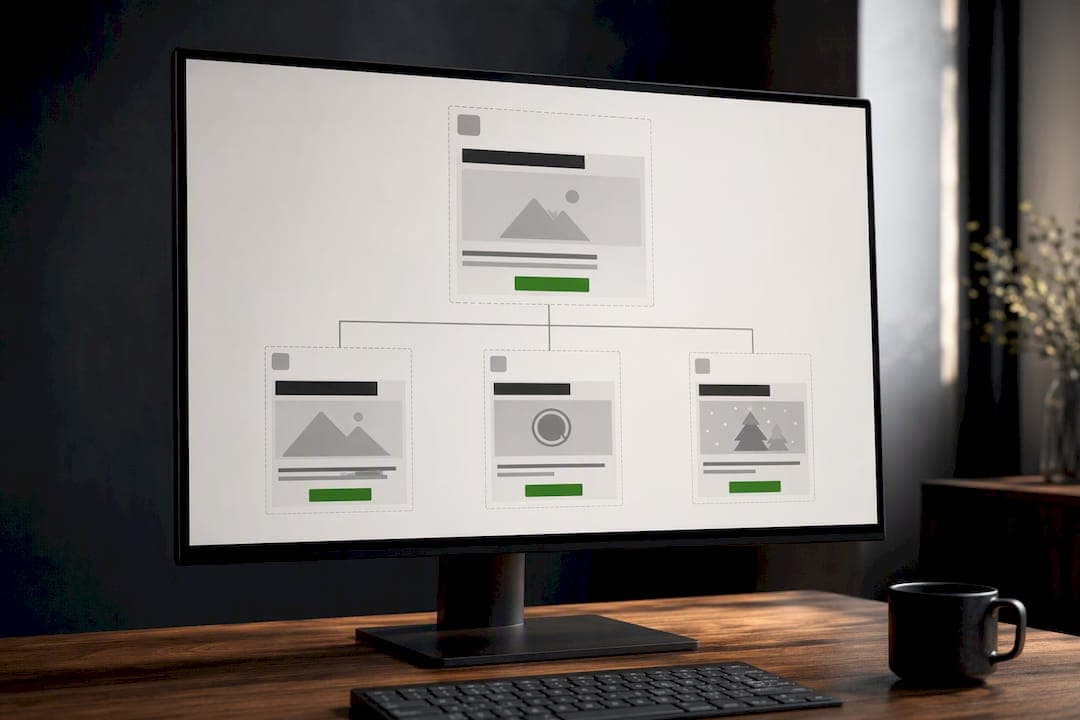
Seasonal or promotional pushes deserve their own light variant too: same structural template, swapped hero image and a time-bound headline ("Ends Sunday" instead of "Shop Now"). Rebuilding a template for every promotion wastes the exact efficiency a template is supposed to buy you.
Keeping Brand Identity Consistent Across Every Template
The fastest way to undercut a good template is to let color values, fonts, or logo treatment drift between the horizontal, square, and portrait versions of the same ad. A viewer who sees the square version on Instagram-style inventory and the portrait version on a mobile app should recognize both as the same brand within half a second, not after reading the headline.
Lock down three things before you touch any template: the exact hex values for your primary and accent colors, the approved logo files in both required ratios, and one font pairing for headline and body text. Every template variant pulls from that same short list. Nothing gets reinvented per aspect ratio.
Logo placement is where consistency breaks down most often, because the square logo and the landscape logo aren't the same file resized. They're different crops that need to look intentional in their own right, not stretched. Keep the logo in the same corner across every template family so it becomes a visual anchor viewers register subconsciously across placements.
A platform that learns your brand's color values, fonts, and logo treatment once and applies them automatically removes the manual drift that happens when three different templates get built by three different people. That consistency compounds. Campaigns run six months apart still look like they came from the same brand, which is exactly the point of having a template system in the first place.
Common Mistakes That Sink a Template-Based Campaign
The most expensive mistake is treating a template as a finished ad instead of a starting structure. Marketers download a template, drop in one hero image, upload it once, and call the campaign built. Google's system needs the full asset matrix, multiple images per aspect ratio, both logo formats, several headline options, to actually optimize anything. One image in one ratio gives the algorithm almost nothing to work with.
A close second: ignoring aspect ratio integrity by letting the platform auto-crop one master image into all three shapes. That usually clips the subject, crowds the CTA out of frame, or leaves awkward dead space. Manual, ratio-specific crops preserve composition in a way automatic cropping rarely does.
Overloading the creative is another recurring problem: baked-in text blocks, multiple competing CTAs, or collage-style layouts stacking three product shots into one frame. These read as cluttered at full size and become unreadable once compressed into a 300x250 unit. Simple, high-contrast layouts with a single focal point beat busy ones in practice, not just in theory.
Last, marketers skip the file-size and format check because "it worked last time," then get surprised when a slightly larger export exceeds 5,120 KB and gets silently excluded from rotation. Check every asset, every time, regardless of how routine the campaign feels.
Publisher Perspective: How Assets.dev Fits a Template-First Workflow
The gap between a good template and a running campaign is almost always export labor: cropping five ratios, resizing two logos, matching brand colors by eye. Assets.dev's brand-learning system reads your colors, fonts, and logo once, then applies them across template families automatically, cutting that labor down to a review pass. CLI, API, and MCP integration let batch renders plug straight into an automated growth workflow instead of a manual export queue. The free plan covers up to 10 videos or 100 image renderings with no card required, and the $9-per-month plan removes that cap entirely once a campaign scales past it.
— Desplega Labs
Get Your Template Matrix Built in Minutes, Not an Afternoon
Assets.dev turns one brand profile into a full set of Google-ready display assets, horizontal, square, portrait, both logo ratios, all sized and compressed correctly on export. You upload your colors and logo once; the system applies them across every prebuilt template family instead of making you rebuild specs for every new campaign.
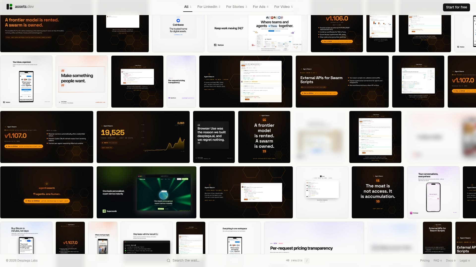
Through July, new accounts get 1,000 credits instead of the usual 100, enough to build out several full campaigns worth of multi-aspect creative before ever touching a paid tier. The free plan needs no card and covers up to 10 videos or 100 image renders on its own. If your campaign runs past that, the paid plan is $9 a month, no long-term commitment.
Start a project on Assets and export your first horizontal, square, and portrait set today.
Sources
A handful of Google resources answer most spec questions faster than a support ticket ever will:
FAQ
What File Size and Format Do Google Display Ads Require?
Images must stay under 5,120 KB and use JPG or PNG format; HTML5 creative built in Google Web Designer follows separate size rules set by Ads Creative Studio.
How Many Images Should I Upload for a Responsive Display Ad?
Google accepts up to 15 images across horizontal, square, and portrait ratios, and uploading at least three to four per ad group gives the optimization system enough variation to test.
What Logo Sizes Does Google Ads Require?
You need a square logo at a 1:1 ratio and a landscape logo at a 4:1 ratio, both under 5,120 KB and in JPG or PNG format.
Can I Use One Template for Every Campaign Goal?
Not effectively. A template built for awareness needs a softer CTA and image-led messaging, while a direct-response version needs tighter copy and an explicit offer, so keep one base template and branch light variants per goal.
Does Assets.dev Handle Google Display Ad Sizing Automatically?
Yes. Assets.dev's brand-learning system applies your colors, fonts, and logo across prebuilt template families and exports the required aspect ratios and file sizes for Google Ads without manual resizing.
Why Do My Display Ad Templates Keep Getting Disapproved?
The most common causes are oversized files, text baked directly into the image, and logos submitted at the wrong ratio, all of which are easy to catch with a preflight checklist before upload.