Field note
Batch Render Six Core Ratios: Social Media Aspect Ratios in 2026
Prioritize vertical formats and batch export correct ratios. Learn the six core 2026 specs, safe areas, and automate exports with templates.
Prioritize 9:16 for anything full-screen, 4:5 for feed portraits, and 1:1 only as your cross-platform fallback. Use 16:9 for landscape and YouTube's standard uploads. Build every export at a minimum 1080px width, since that's the practical floor most platforms compress down to anyway. If you're producing at scale, a batch tool like assets dev can render all four ratios from one template in a single pass instead of you resizing each one by hand.
TL;DR:
- Prioritize 9:16 for Stories, Reels, Shorts, and TikTok, with a minimum of 1080×1920 pixels to ensure quality and compatibility across platforms.
- Use 4:5 for Instagram and Facebook feeds at 1080×1350 pixels, designing safe zones around 1080×1610 pixels to avoid content cropping.
- Batch export templates like assets dev enable simultaneous rendering of all key ratios, saving time and maintaining brand consistency in workflows.
- Avoid resizing or stretching designs without maintaining the original aspect ratio to prevent distortion, always crop or recompose content within correct proportions.
- As vertical formats expand, safe-area margins and accessibility considerations become more critical, demanding thorough QA and templates optimized for low-vision and mobile use.
Table of Contents
- What Are Social Media Aspect Ratios in 2026?
- Quick Cheat Sheet for 2026 Social Post Sizes
- Instagram Sizes and Safe Areas for 2026
- Facebook Sizes for Feed, Stories, and Ads in 2026
- X (Twitter) Image and Video Dimensions for 2026
- LinkedIn Dimensions for Profiles, Banners, and Posts
- TikTok Aspect Ratios and How to Repurpose Them
- YouTube Thumbnail, Banner, and Shorts Specs for 2026
- Pinterest, Snapchat, Threads, and Other Platforms
- How to Choose the Right Ratio for Every Post
- Scaling Correct Ratios With Templates and Automation
- Aspect Ratio vs. Pixel Dimensions: Why the Difference Matters
- Portrait, Landscape, or Square: A Mobile-First Decision
- Common Aspect Ratio Mistakes That Hurt Your Content
- Where Aspect Ratios Are Headed Later in 2026
- AI Tools Are Changing How Fast Teams Adjust Ratios
- Accessibility and Aspect Ratios: What Gets Overlooked
- What Actually Works in 2026: An Editorial Take
- Export Every Ratio Without the Manual Resizing
- Where to Track Future Spec Changes
- Sources
- FAQ
What Are Social Media Aspect Ratios in 2026?
An aspect ratio is the proportional relationship between an image's width and height, written as a ratio like 9:16 or 4:5. Pixel dimensions are the actual measurements, like 1080×1920, that fill that ratio at a specific resolution.
This distinction trips up more marketers than it should. You can have a 9:16 video exported at a minimum resolution around 720×1280 or at 1080×1920, and both are technically the same aspect ratio, just at different resolutions. The ratio controls the shape; the pixel count controls the sharpness. When a platform's help page says "use 1080×1920," it's really telling you two things at once: keep the 9:16 shape, and don't go below 1080 pixels wide, or your video will look soft on newer phone screens.
This matters because a lot of cropping disasters happen when someone matches the pixel count but ignores the ratio, or vice versa. A 1200×1200 image is a perfect 1:1 square regardless of resolution, but if you stretch it to 1200×1500 without adjusting the ratio label, you've distorted it, not just resized it. Sprout Social's platform tables list both numbers for exactly this reason: ratio tells you the shape to design in, pixels tell you the resolution to export at.
Think of aspect ratio as the picture frame's shape and pixel dimensions as how much detail fits inside that frame.
Quick Cheat Sheet for 2026 Social Post Sizes
Bookmark this table. It covers the six ratios that account for nearly every placement across major platforms in 2026.
| Aspect ratio | Common use | Recommended pixels |
|---|---|---|
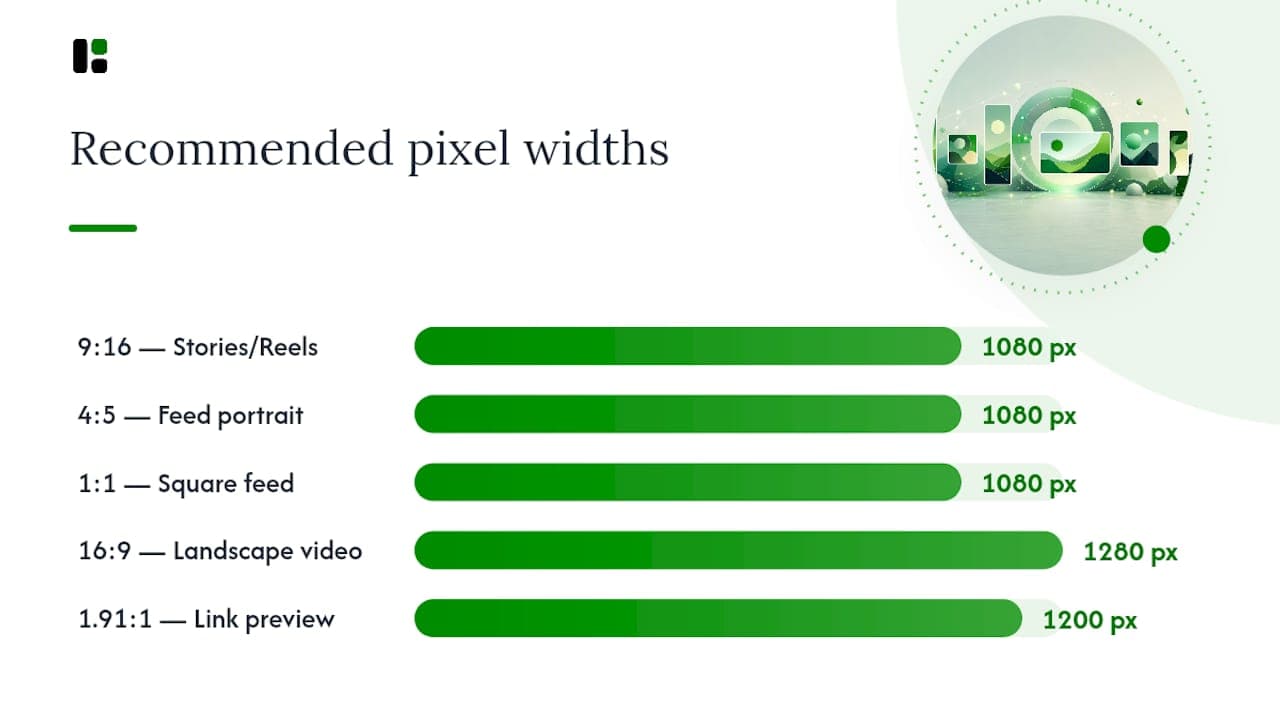
| 9:16 | Stories, Reels, Shorts, TikTok | 1080×1920 |
| 4:5 | Instagram and Facebook feed portraits | 1080×1350 |
| 1:1 | Square feed posts, safe fallback | 1080×1080 |
| 16:9 | YouTube standard video, landscape | 1280×720 or 1920×1080 |
| 1.91:1 | Link previews, Open Graph images | 1200×630 |
| 2:3 | Pinterest pins | 1000×1500 |
Pro Tip: When exporting a 9:16 Story or Reel, keep your logo, captions, and call-to-action text inside a central safe area of roughly 1080×1610. The top and bottom margins get covered by profile icons, captions, and the reply bar on most apps.
Most guides settle on 1080 pixels wide as a practical minimum standard across nearly every ratio in this table, which is worth remembering if you only take one number away from this section. Going higher rarely hurts; going lower risks visible compression artifacts once a platform re-encodes your upload.
On file types: JPG and PNG cover static images, MP4 covers video, and most platforms cap uploads somewhere between 5 and 30 megabytes depending on the placement. Stories and Reels tend to sit at the lower end of that range, while feed video allows more headroom. Compress before you upload; letting the platform do it for you produces less predictable results.
Instagram Sizes and Safe Areas for 2026
Instagram primarily supports a few core aspect ratios for images, but the safe zones matter more than the raw pixel counts.
- Profile picture: 320 to 400 pixels square, cropped to a circle. Keep faces and logos centered since the edges get clipped.
- Feed portrait: 1080×1350 (4:5) is the preferred shape and the one Instagram gives the most vertical space to in the grid.
- Feed range: Instagram supports anywhere from 1.91:1 to 4:5, but anything wider than 4:5 gets cropped to fit the grid preview.
- Square post: 1080×1080, still supported but visually smaller in-feed than a 4:5 upload.
- Reels and Stories: 1080×1920 (9:16), with a central safe area around 1080×1610 to avoid the caption bar, sticker tray, and profile overlay.
The grid crops every post to a uniform thumbnail shape regardless of the original ratio you uploaded, so a 4:5 portrait that looks great full-size can lose its bottom third in the grid preview. Design your focal point in the top two-thirds of the frame to survive that crop.
Pro Tip: Build three export presets for every Instagram campaign: one 9:16 for Reels and Stories, one 4:5 for the feed, and one 1:1 as backup for carousels or cross-posting. Naming them consistently ("brand_reel_916," "brand_feed_45") saves your team from re-guessing dimensions every launch.
Instagram consistently rewards taller frames in the feed, largely because vertical formats now claim more screen real estate on a scrolling phone than a square ever could.
Facebook Sizes for Feed, Stories, and Ads in 2026
Facebook distinguishes aspect ratio and size preferences between organic posts and paid content, and mixing them up is one of the most common export mistakes marketers make.
- Profile photo: 170×170 display size, uploaded larger (at least 400×400) and cropped to a circle, so keep subjects centered.
- Cover photo: 820×312 on desktop, but the mobile crop is narrower, so keep critical text and logos within the middle 640 pixels.
- Feed posts: vertical 1080×1350 (4:5) performs best for organic reach; link previews default to landscape 1200×630 (1.91:1).
- Stories: 1080×1920 (9:16), and Facebook enforces the same top and bottom safe margins as Instagram Stories.
- Ads: keep every image in a carousel at the same ratio, since mismatched shapes create jarring size jumps as users swipe.
File size limits on Facebook run tighter than most people expect, particularly for Stories, where oversized uploads sometimes get rejected outright rather than compressed automatically. Test a small batch before scheduling a full campaign.
The 1200×630 link preview size isn't unique to Facebook. It's part of the Open Graph standard shared across Facebook, X, and LinkedIn, which is why one properly sized preview image can serve all three platforms without a redesign.
X (Twitter) Image and Video Dimensions for 2026
X's cropping algorithm has burned enough marketers that getting these numbers right upfront saves real rework later.
- Profile avatar: 400×400, displayed as a circle.
- Header image: 1500×500, and it gets cropped differently on mobile versus desktop, so keep text away from the far edges.
- Feed images: 1080×1080 (square), 1080×1350 (portrait), or 1600×900 (landscape) all display cleanly without forced cropping.
- Video tab and vertical video: X now favors 9:16 in its dedicated video tab, with a minimum resolution around a minimum resolution of around 720×1280.
- File limits: static images generally stay under 5MB; video allows considerably more, though compression before upload still keeps quality consistent.
X's feed has historically been landscape-friendly, but the platform's push into a dedicated video tab means vertical clips now get real placement there, not just in the main timeline. If you're producing video for X in 2026, don't assume 16:9 is still the safe universal choice. Test a 9:16 cut for the video tab alongside your landscape feed version.
LinkedIn Dimensions for Profiles, Banners, and Posts
LinkedIn users tend to view on desktop, influencing banner and cover image dimensions more than most social platforms, which changes how much your banner and cover images need to account for wide-screen safe zones.
- Profile photo: 400×400 (1:1), cropped to a circle in feed views.
- Cover banner: 1584×396 (roughly 4:1), a wide format where text needs to sit well clear of the profile photo overlay in the bottom left corner.
- Link preview: 1200×627 (1.91:1), matching the broader Open Graph standard used across other platforms.
- Post images: 1080×1350 tends to perform well in the native feed, mirroring the portrait preference seen on Instagram and Facebook.
- Company page cover: similar wide-banner rules apply; keep logos and headlines centered rather than edge-anchored, since mobile crops the sides first.
Because LinkedIn viewers split fairly evenly between desktop and mobile, banner text that reads fine on a laptop screen can get clipped on a phone. Check your export in both a spread desktop preview and a cropped mobile simulation before publishing. If your team produces LinkedIn video regularly, the platform's specific video dimension requirements are worth bookmarking separately, since video safe zones behave differently than static banners. A deeper breakdown of LinkedIn image sizing covers edge cases like carousel documents and native video thumbnails that don't fit neatly into the table above.
TikTok Aspect Ratios and How to Repurpose Them
TikTok is the platform that made vertical-first the default assumption for 2026, and its spec sheet reflects that with almost no landscape support at all.
- Main format: 9:16 at 1080×1920 covers essentially every placement, from For You Page videos to ads.
- Profile image: 200×200 minimum, though uploading larger avoids blur on high-density phone screens.
- Photo mode and carousels: also built around 1080×1920, keeping the same vertical frame as standard video.
- Repurposing: converting a 9:16 TikTok clip into 16:9 for YouTube or 4:5 for Instagram works best when you reframe around the subject rather than stretch or letterbox the original footage.
The repurposing question comes up constantly on marketing teams that treat TikTok as their primary shoot format. The cleanest approach is reframing to keep the subject centered, or adding a blurred background pillarbox rather than just squeezing a vertical clip sideways into a landscape frame, which distorts faces and text badly.
Pro Tip: Shoot with extra headroom above and below your subject on TikTok, even though you're filming vertical. That buffer gives you cropping flexibility later when you need a 4:5 or 1:1 version for cross-posting, instead of forcing you to reshoot.
YouTube Thumbnail, Banner, and Shorts Specs for 2026
YouTube runs two parallel spec sheets now: one for traditional landscape video, and one for Shorts, which behaves more like TikTok than YouTube's own legacy format.
- Thumbnail: 1280×720 (16:9) is the accepted minimum; uploading at 2560×1440 keeps thumbnails crisp on large displays and TVs.
- Channel banner: 2560×1440 overall, but keep essential logos and text inside the central safe area of roughly 1546×423, since the visible crop changes across desktop, mobile, and TV.
- Shorts: 9:16 at 1080×1920, matching TikTok and Instagram Reels almost pixel-for-pixel.
- Standard videos: 16:9 at 1920×1080 remains the default for long-form uploads.
YouTube's banner safe area is the one spec on this list most teams get wrong, mainly because the difference between the full 2560×1440 canvas and the 1546×423 safe zone is easy to miss until you preview the channel on a phone. Design your banner text and logo entirely within that inner box, and treat the surrounding canvas as decorative background only.
Pinterest, Snapchat, Threads, and Other Platforms
A handful of platforms outside the big five still drive real traffic, and each one rewards a slightly different shape for a specific reason tied to how people browse it.
- Pinterest pins: 1000×1500 (2:3) is the recommended size for discovery performance, since Pinterest's masonry grid gives taller pins more visual weight and screen time.
- Snapchat and Spotlight: 1080×1920 (9:16), matching the immersive full-screen format shared with Stories and Shorts across other apps.
- Threads and Bluesky: largely inherit Instagram's sizing conventions, since both grew out of that same feed-scrolling behavior; 1080×1080 and 1080×1350 both display cleanly.
- Avatars and banners: follow the same circle-crop and centered-logo rules as the major platforms; nothing unusual here.
The reason Pinterest breaks from the vertical-video crowd comes down to intent. Pinterest is a discovery and search tool where users scroll slowly and click through, not a passive video feed, so a taller 2:3 image simply earns more scroll time and clicks than a squarer shape would in that specific browsing pattern. Choose tall 2:3 for anything meant to be saved and searched later, and reserve full 9:16 vertical for anything meant to be watched in the moment.
How to Choose the Right Ratio for Every Post
Picking the right shape isn't guesswork once you run it through a simple sequence. Follow these four questions in order every time you plan a new asset.
- What's the placement? A Story, a feed post, and a link preview each have a fixed shape the platform expects. Start there before you touch a design tool.
- What's the goal? Full-screen immersive content (Stories, Reels, Shorts) wants 9:16. Feed discovery and saves want 4:5 or 2:3. Quick link shares want 1.91:1.
- What's the primary device? Mobile-first placements demand vertical; desktop-heavy platforms like LinkedIn tolerate wider banners.
- What format does the final export need? Confirm file type (JPG, PNG, MP4) and size limits before you render, not after.
Cross-posting the same asset everywhere is tempting, but it usually means picking one compromise ratio and accepting it will underperform on at least one platform. A single square formats can serve as a fallback across most networks, but may underperform native ratios, but it consistently underperforms the platform-native shape it's substituting for. Reserve one-size-fits-all exports for time-sensitive posts, and template the high-value ratios separately whenever a campaign has real budget behind it.
Before anything goes live, run this quick QA pass:
- Confirm the safe area is clear of critical text, logos, and faces.
- Check text legibility at actual mobile display size, not just on your design monitor.
- Verify resolution meets the platform minimum (usually 1080px wide).
- Confirm file type and size sit within platform limits.
- Name files with a consistent convention (platform_ratio_campaign) so your team never has to guess dimensions mid-launch.
Pro Tip: Keep a shared preset library across your team, not just a personal one. The fastest way to lose brand consistency is having three designers each guessing at "close enough" pixel dimensions for the same campaign.
Scaling Correct Ratios With Templates and Automation
Manually resizing one campaign into six platform shapes is a rounding error the first time. By the twentieth campaign, it's a real time sink, and it's where template-driven workflows earn their place.
A practical setup looks like this: build a brand profile once, capturing your logo placement, color palette, and typography rules. Select a template built for your campaign type. Then batch-render that single design into 9:16, 4:5, 1:1, and 16:9 simultaneously, either through a web dashboard or through an API and CLI integration if the exports feed into an automated publishing flow.
- One brand profile drives every export, so colors and fonts stay consistent across all four ratios without manual rechecking.
- Batch rendering through an API or CLI means a growth team can trigger fresh exports as part of an existing automation pipeline instead of opening a design tool for every campaign.
- Safe-area and focal-point rules get baked into the template itself, so a portrait crop doesn't accidentally clip a logo that looked fine in the square version.
assets dev was built around exactly this workflow: curated templates for the ratios covered in this guide, with a free plan that covers up to 10 videos or 100 image renderings before any payment is required, so a team can test the batch export flow before committing to anything. For teams publishing weekly across four or five platforms, the time saved on manual resizing alone tends to justify trying it once.
Aspect Ratio vs. Pixel Dimensions: Why the Difference Matters
Confusing these two terms causes more wasted design hours than any other mistake on this list. Aspect ratio is the shape, expressed as a proportion like 9:16. Pixel dimensions are the actual width and height of the file you export, like 1080×1920.
Here's why the distinction earns its own explanation rather than a footnote. A 9:16 video can be exported at a minimum resolution around 720×1280, 1080×1920, or even 2160×3840, and all three keep the same 9:16 shape while differing wildly in file size and sharpness. Platforms generally specify a minimum pixel count to prevent blurry uploads, then let the ratio dictate how the frame gets cropped or displayed.
Where teams get tripped up is resizing a file without preserving its ratio. Stretching a 1080×1080 square into an 1080×1350 rectangle without cropping distorts every face and logo in the frame, because you've changed the ratio without re-composing the content inside it. The correct move is always to recompose or crop within the new ratio, never to stretch.
Treat pixel dimensions as your resolution floor and aspect ratio as your composition rule. Get the ratio right first, choose your focal point and safe area within that shape, and only then confirm the pixel count meets the platform's stated minimum.
Portrait, Landscape, or Square: A Mobile-First Decision
The single biggest shift behind this year's guidance is simple: more than 80% of social media consumption happens on vertical mobile screens, which flips the old landscape-default assumption on its head.

Portrait formats (9:16, 4:5, 2:3) win whenever the placement is full-screen or feed-scrolling on a phone. That covers Stories, Reels, Shorts, TikTok, and increasingly the main Instagram and Facebook feeds. A vertical frame simply occupies more of a phone screen than a square or landscape image ever could, which is why platforms keep nudging creators toward taller formats.
Square (1:1) still has a role, mainly as a cross-posting compromise or for carousel content where consistent framing across multiple slides matters more than maximizing any single image's screen presence.
Landscape (16:9, 1.91:1) survives in three specific lanes: YouTube's traditional long-form video, link preview thumbnails, and desktop-heavy platforms like LinkedIn where wide banners still make visual sense. Outside those lanes, landscape is becoming the exception rather than the default.
The practical rule for 2026: if you're unsure which way to shoot, shoot vertical. It's far easier to crop a vertical frame down into a square or add pillarboxing for landscape than to stretch a landscape shot into something that fills a phone screen convincingly.
Common Aspect Ratio Mistakes That Hurt Your Content
Most cropping disasters trace back to the same handful of avoidable errors, repeated campaign after campaign.

Cropping the wrong focal point. Uploading a square image to a platform that displays it as a portrait thumbnail often clips the top and bottom, cutting off faces or text that were fine in the original frame. Always preview the actual in-feed crop before publishing, not just the full uploaded image.
Letterboxing landscape video into vertical placements. Forcing a 16:9 clip into a 9:16 Story or Reel slot without reframing leaves black bars above and below, which reads as low effort and shrinks the actual visible content to a fraction of the screen.
Uploading below the resolution floor. Anything under roughly 1080 pixels wide risks visible blur once a platform compresses and re-encodes it, especially on high-density phone displays. What looked sharp on your desktop monitor can look noticeably soft on a viewer's phone.
Ignoring safe areas entirely. Placing a logo or caption near the very edge of a 9:16 Story frame all but guarantees it gets covered by a profile icon, the caption box, or the reply bar. The roughly 1080×1610 central safe area exists precisely to prevent this.
Stretching instead of recomposing. Resizing a square image directly into a rectangle without cropping distorts every proportion in the frame. Recompose within the new ratio; never just stretch the canvas.
Each of these mistakes is fixable in seconds if you catch it before publishing, but nearly invisible once the post is live and the damage is done.
Where Aspect Ratios Are Headed Later in 2026
The trajectory is clear enough that planning around it now saves a redesign later. Full-screen vertical formats keep expanding their footprint, and 9:16 is increasingly treated as the default shoot format rather than a special case reserved for Stories and Reels.
Expect platforms to keep tightening their safe-area guidance rather than loosening it, as more UI elements (captions, stickers, shopping tags, reply bars) compete for space inside the same 1080×1920 frame. That trend pushes creators toward simpler compositions with more breathing room around the subject, since the usable safe zone keeps shrinking relative to the full canvas.
Square content isn't disappearing, but its role is narrowing to specific use cases: carousels, cross-posting fallbacks, and grid consistency, rather than a primary format in its own right. Meanwhile landscape holds its ground almost entirely within YouTube's traditional long-form space and desktop-oriented platforms like LinkedIn banners, a shrinking share of total content volume as more viewing shifts to phones.
The practical takeaway for teams planning content calendars later this year: treat vertical as your primary shoot format, budget square and landscape as secondary derivatives, and expect safe-area margins to matter more, not less, as platform UIs keep adding overlay elements.
AI Tools Are Changing How Fast Teams Adjust Ratios
The manual resizing bottleneck that used to eat hours per campaign is shrinking fast, mostly because AI-assisted reframing tools can now detect a subject's focal point and recompose it into a different ratio without a human manually redrawing the crop box every time.
This matters most for teams repurposing one shoot across five or six platforms. Instead of a designer manually cropping a 9:16 TikTok clip down into 4:5 for Instagram and 16:9 for YouTube, automated focal-point detection can suggest (or directly render) a crop that keeps the subject centered across all three shapes. The time savings compound fast once you're producing multiple assets per campaign rather than one.
The tradeoff worth knowing: automated recomposition handles straightforward subject-centered content well, but it still struggles with busy frames containing multiple focal points, like group shots or text-heavy graphics with several competing elements. Those cases still benefit from a human check before publishing, even when a tool generates the first draft.
The broader shift is templates that already know your brand's safe-area rules and focal-point preferences, so every new export starts from a correct baseline instead of a blank crop tool. That's less about replacing designers and more about removing the repetitive resizing work that never required much creative judgment in the first place.
Accessibility and Aspect Ratios: What Gets Overlooked
Aspect ratio choices affect more than aesthetics. They directly affect whether people with visual or motor impairments can actually read and interact with your content.
Text legibility scales with how much of the frame your ratio actually gives you. A 9:16 vertical frame gives captions more vertical room to breathe at a readable size than a cramped 1:1 square trying to fit the same message. For viewers with low vision using screen magnification, oversized safe-area margins and generous text sizing inside the safe zone aren't just good design, they're the difference between content that's usable and content that isn't.
Color contrast against the background matters more in vertical full-screen formats specifically because Stories and Reels often overlay text directly on busy photo or video backgrounds, with no solid color block behind it. Building a semi-transparent text box into your template, rather than placing text directly over untreated footage, helps significantly for viewers with low-contrast sensitivity.
Captions and alt text deserve the same attention as pixel dimensions. A perfectly sized 1080×1920 video with no captions excludes viewers who are deaf or hard of hearing just as effectively as a blurry export excludes everyone. When you're building export presets and QA checklists, add "captions burned in or platform-native captions enabled" as a required field, not an optional afterthought.
The safe-area guidance covered earlier in this piece exists partly for aesthetic reasons and partly for accessibility ones. Text that survives the crop is also text that stays large enough and positioned consistently enough for assistive technology and low-vision viewers to actually use.
What Actually Works in 2026: An Editorial Take
Vertical-first isn't a trend chasing algorithm changes. It reflects how people physically hold their phones, and that's not reversing anytime soon. Teams that treated 2026's shift to 9:16 and 4:5 as a temporary fad kept exporting landscape-first content and watched engagement quietly erode without understanding why.
What's underrated in most of the advice floating around isn't the ratio recommendations themselves. Every major guide agrees on roughly the same numbers. What's underrated is the QA step. The teams producing the strongest results treat their safe-area checklist with the same seriousness as their copy review, because a beautifully written caption sitting behind a sticker tray helps nobody.
The other overlooked lever is templating. Not because templates make content generic, but because they encode your brand's safe-area and focal-point rules once, so every subsequent export inherits those decisions automatically instead of relying on whoever's resizing that week to remember them. That consistency compounds across a content calendar in a way that's hard to appreciate until you've watched a team skip it and ship a dozen slightly-off exports in a row.
If there's one actionable takeaway worth carrying forward, it's this: pick your three core ratios, template them once, and stop rebuilding the wheel every campaign.
— Desplega Labs
Export Every Ratio Without the Manual Resizing
If this guide made one thing clear, it's that hitting six or seven different aspect ratios correctly, every single campaign, is a lot of repetitive work when you're doing it by hand in a general design tool. assets dev exists specifically to remove that bottleneck: pick a template, teach it your brand once, and batch-render 9:16, 4:5, 1:1, and 16:9 versions of the same asset in one pass, whether you're working from the web dashboard or triggering exports through the API or CLI inside an existing automation flow.
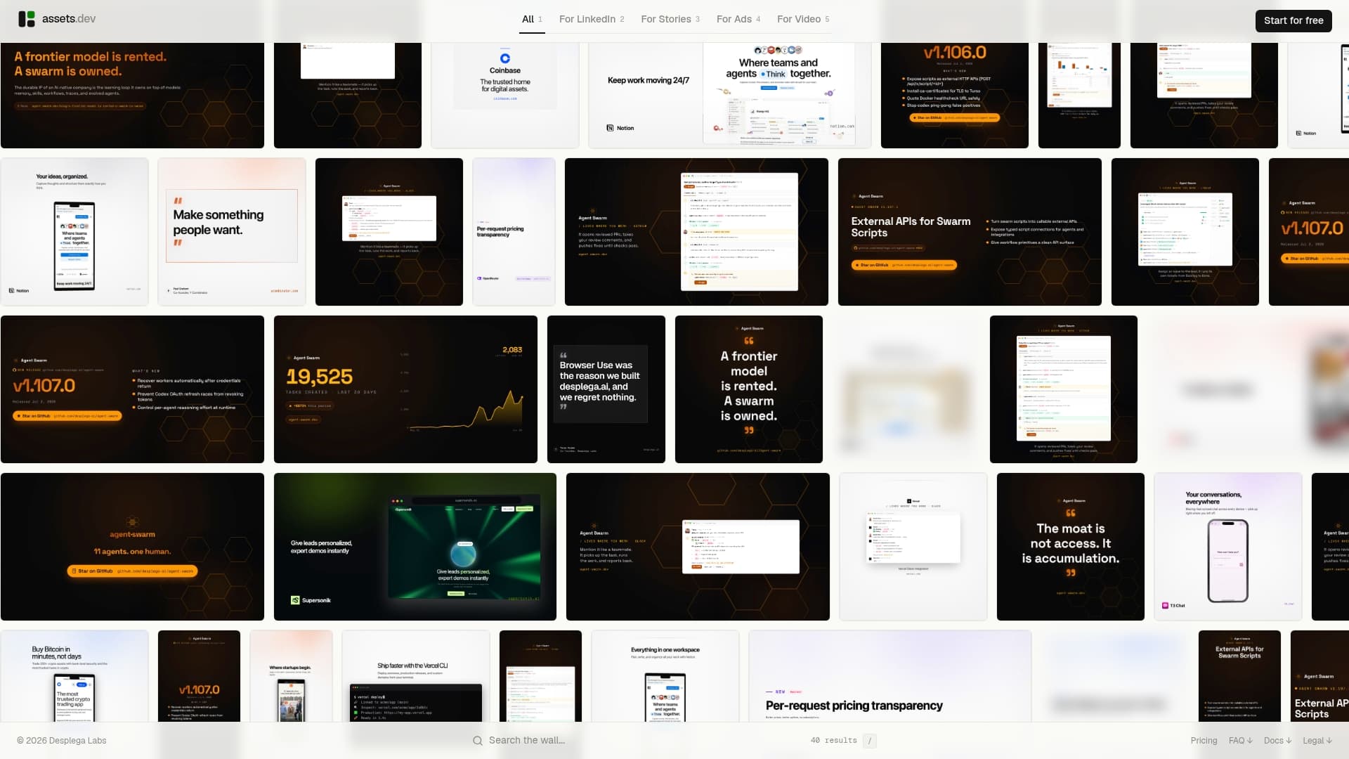
The free plan covers up to 10 videos or 100 image renderings with no credit card required, which is enough to test the batch export workflow on a real campaign before deciding whether to upgrade. Teams that outgrow that quota move to a single paid plan at $9 per month rather than navigating a tiered pricing maze. Through July, new signups get 1,000 credits instead of the usual 100, which is worth timing your trial around if you're reading this while that promotion is live.
If your team publishes across LinkedIn, Instagram, X, or Substack more than once a week, start with a free account at assets dev and run your next campaign's exports through it instead of a manual resize job.
Where to Track Future Spec Changes
Platform specs shift often enough that this guide will need updates before the year is out. These sources track changes as they happen:
- Hootsuite's social media image size guide for broad cross-platform updates.
- Sprout Social's platform-by-platform tables for exact pixel specs.
- Buffer's yearly sizing guide for engagement-focused ratio recommendations.
- MediaSizes' aspect ratio breakdowns for safe-area specifics.
- Iconosquare's image size guide for Pinterest and niche platform coverage.
For anything time-sensitive, check each platform's own creator or business help documentation directly, since third-party guides typically update within days of a change, not the same hour.
Sources
- Social media image sizes for all networks August 2026
- Always up-to-date guide to social media image sizes
- Social Media Image Sizes in 2026: Guide for 9 Major Networks
- Social Media Aspect Ratios: Complete Guide for Every Platform (2026)
- Social Media Image Sizes: The Complete 2026 Guide
FAQ
Is 4:3 or 16:9 Better for Social Media in 2026?
Neither is the priority anymore. Mobile-first placements favor vertical ratios like 9:16 and 4:5, and 16:9 is now reserved mainly for YouTube's standard long-form video and desktop-oriented content.
What Aspect Ratio Does Instagram Use in 2026?
Instagram's feed favors 4:5 (1080×1350) for portrait posts, supports 1:1 (1080×1080) as a fallback, and uses 9:16 (1080×1920) for Reels and Stories.
Is TikTok 9:16 or 3:4?
TikTok's primary format is 9:16 at 1080×1920 for nearly all video and photo-mode content, not 3:4, which is closer to Instagram's older feed ratio.
What's the Safest Single Ratio for Cross-Posting Everywhere?
A 1:1 square (1080×1080) displays acceptably across almost every platform, though it consistently underperforms each platform's native preferred shape, so treat it as a fallback rather than a primary strategy.