Field note
100 Social Proof Graphics in Minutes for Designers
Generate social proof graphics fast. assets.dev learns your brand in seconds. Start free and export up to 100 image or 10 video renders.

Social proof graphics are visual assets, testimonial cards, logo strips, stat callouts, review snippets, and case-study panels, that show real customer results instead of just claiming them. Their job is simple: sit next to your primary call to action and remove the doubt that stops someone from clicking. If you're starting from zero, pick one format (a testimonial card or a stat callout) and place it directly beside your signup or demo button before touching anything else.
TL;DR:
- Placing a single, verified statistic or testimonial beside your primary call to action can significantly increase click-through rates and perceived credibility.
- Use high-quality logos as SVGs and include real customer names, photos, or job titles to enhance authenticity and trustworthiness of social proof graphics.
- Adapt one master template for multiple platforms like Instagram, LinkedIn, and ads rather than creating unique assets from scratch, saving time and maintaining brand consistency.
- Incorporate real-time proof panels displaying recent signups or sales, but keep them subtle, timestamped, and honestly presented to avoid appearing manipulative.
- Utilize ready-made templates and automation tools to generate channel-appropriate proof graphics quickly without needing extensive design resources.
Table of Contents
- What Are the Main Types of Social Proof Graphics?
- Where Should You Place Social Proof Graphics for the Best Results?
- How Do You Design Social Proof Graphics People Actually Trust?
- What Ready-Made Templates and Resources Should You Use?
- How Do You Adapt One Template Across Instagram, LinkedIn, and Ads?
- Why We Built assets.dev Around Social Proof Templates
- Try assets.dev for Your Next Batch of Proof Graphics
- Sources
- FAQ
What Are the Main Types of Social Proof Graphics?
Not every proof format fits every page, and the wrong one wastes screen space you needed for the ask itself.
Testimonial cards work best with three elements: a direct quote, a small avatar, and a role or title ("VP of Growth" carries more weight than a name alone). Keep the quote short enough to read quickly for better impact.
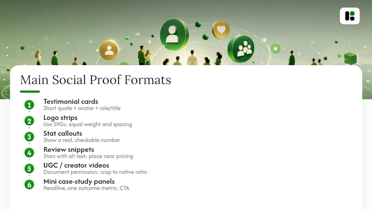
Logo strips should use SVG files, not screenshots, so they stay sharp at any size. Give each logo equal visual weight and consistent spacing; a strip where one logo dwarfs the others looks amateur.
Stat callouts need a real, checkable number. "3x faster onboarding" only works if you can back it up somewhere on the page or in a linked case study.
Review snippets and star ratings are strongest near pricing, but always pair the stars with alt text describing the rating, since color alone fails accessibility standards.
UGC and creator videos need documented permission before use, and crop to the platform's native aspect ratio rather than stretching a square clip into a vertical Story.
Mini case-study panels work as a headline, one outcome metric, and a CTA, no more than three lines of text before the button.
Where Should You Place Social Proof Graphics for the Best Results?
Placement matters more than the design itself. A gorgeous testimonial card buried in a footer does nothing. The goal is to put proof exactly where hesitation happens.
- Above the fold: a logo strip or one bold stat gives visitors an instant credibility signal before they scroll.
- Next to the primary CTA: a short testimonial or a single quantified line reduces the friction that kills clicks. Pairing specific proof directly with the ask measurably increases perceived credibility on B2B pages.
- Product and pricing pages: swap generic praise for outcome-specific proof tied to the exact plan or feature being viewed.
- Social posts and ads: a short UGC clip or a testimonial carousel outperforms a static product shot, especially paired with "shop now" style CTAs.
- Email and landing pages: rotate proof so returning visitors don't see the same quote three times in a row.
A minimal, real-time proof panel, showing recent signups or order counts, can also work well on storefronts and product pages when it stays subtle and honestly timestamped.
How Do You Design Social Proof Graphics People Actually Trust?
Believability is the whole point. A testimonial with no name, no photo, and a suspiciously perfect quote reads as fake, even when it's real.
- Use only metrics you can defend if someone asks where the number came from.
- Build clear hierarchy: headline first, proof statement second, attribution last, so the eye moves in one direction.
- Add authenticity cues: a real avatar, job title, company name, or a verified badge where the platform supports one.
- Design for accessibility: write alt text for every image, keep contrast ratios readable, and never use color as the only signal (a green checkmark needs a label too).
- Export logos as SVG, compress photos, and keep video loops short so pages load fast on mobile connections.
- Track outcomes past click-through rate. Watch form starts, form completions, and qualified leads, since measuring the full funnel instead of just clicks tells you whether the proof actually persuaded anyone.
Pro Tip: Run the same landing page with and without your top testimonial card for two weeks. If form starts rise but qualified leads don't, your proof is attracting clicks without attracting the right buyer, a signal to swap the testimonial for one from a closer-fit customer.
Well-built visual proof doesn't just decorate a page. In high-stakes contexts like courtroom exhibits, clear narrative graphics have swung outcomes by making complex evidence easy to grasp at a glance, and the same principle scales down to a testimonial card: clarity beats decoration every time.

What Ready-Made Templates and Resources Should You Use?
You don't need to build every proof graphic from a blank canvas. Four template types cover most needs: carousel sets for social feeds, hero banners for websites, short motion snippets for video ads, and logo strips for headers and footers.
Before adopting any template, run it through a quick check:
- Are the text and image layers actually editable, or is the quote baked into a flat file?
- Does it support brand presets (your colors, fonts, and logo) instead of forcing a manual rebuild?
- Are there export presets for each channel size, or just one fixed dimension?
- Does the layout reflow responsively for mobile and desktop?
This is where a platform like assets dev fits naturally into the workflow. It learns your branding in seconds and applies it across every template, and its CLI, API, and MCP integrations mean you can generate fresh proof graphics automatically as part of a growth pipeline instead of exporting one image at a time. For inspiration before you commit to a layout, browsing tagged galleries on sites like Dribbble shows dozens of real testimonial and logo-strip treatments, while vector libraries like Vecteezy supply raw icon and badge assets in SVG, PNG, and PSD if you're building from scratch. Always confirm a template's license covers commercial use before shipping it to a client or a live campaign.
How Do You Adapt One Template Across Instagram, LinkedIn, and Ads?
Pick a single master template, one testimonial or stat design, and adjust it channel by channel instead of designing five separate assets from scratch.
- Instagram carousel: split the story into three frames, hook, proof, action. Keep on-image text under roughly 15 words per frame so it's readable on a phone screen. The social media carousel format works particularly well for stacking a stat, then a quote, then a CTA slide.
- LinkedIn: use a single square or 4:5 image with one bold stat and a caption under 150 characters; LinkedIn audiences skim fast and reward direct claims over long captions.
- Website hero: compress the same stat into a headline-adjacent line, paired with a logo strip right beside the CTA button.
- Paid ads: lead with the metric in the foreground and one short verified line beneath it, trimmed to fit the platform's character limits. Pairing a visual with the CTA consistently drives stronger engagement than text-only ad copy.
Pro Tip: Export all four versions from the same source file. If your proof graphic requires four separate design sessions, the template isn't actually reusable, it's just four templates wearing one name.
Why We Built assets.dev Around Social Proof Templates
We built assets dev because most teams don't lack good testimonials; they lack the hours to turn them into channel-ready graphics fast enough to matter. A quote sitting in a spreadsheet helps nobody. A quote formatted for Instagram, LinkedIn, and your homepage hero, all matching your brand, is what actually moves a funnel.
That's why brand learning happens in seconds and why the CLI, API, and MCP integrations exist: so a proof graphic can be generated automatically the moment a new review or case study lands, without a designer opening a new file. Browse the custom Instagram graphics and Instagram carousel collections if you want to see the templates in action before trying one yourself.
— Desplega Labs
Try assets.dev for Your Next Batch of Proof Graphics
If you're tired of rebuilding the same testimonial card in five sizes, assets dev is built to skip that step entirely.
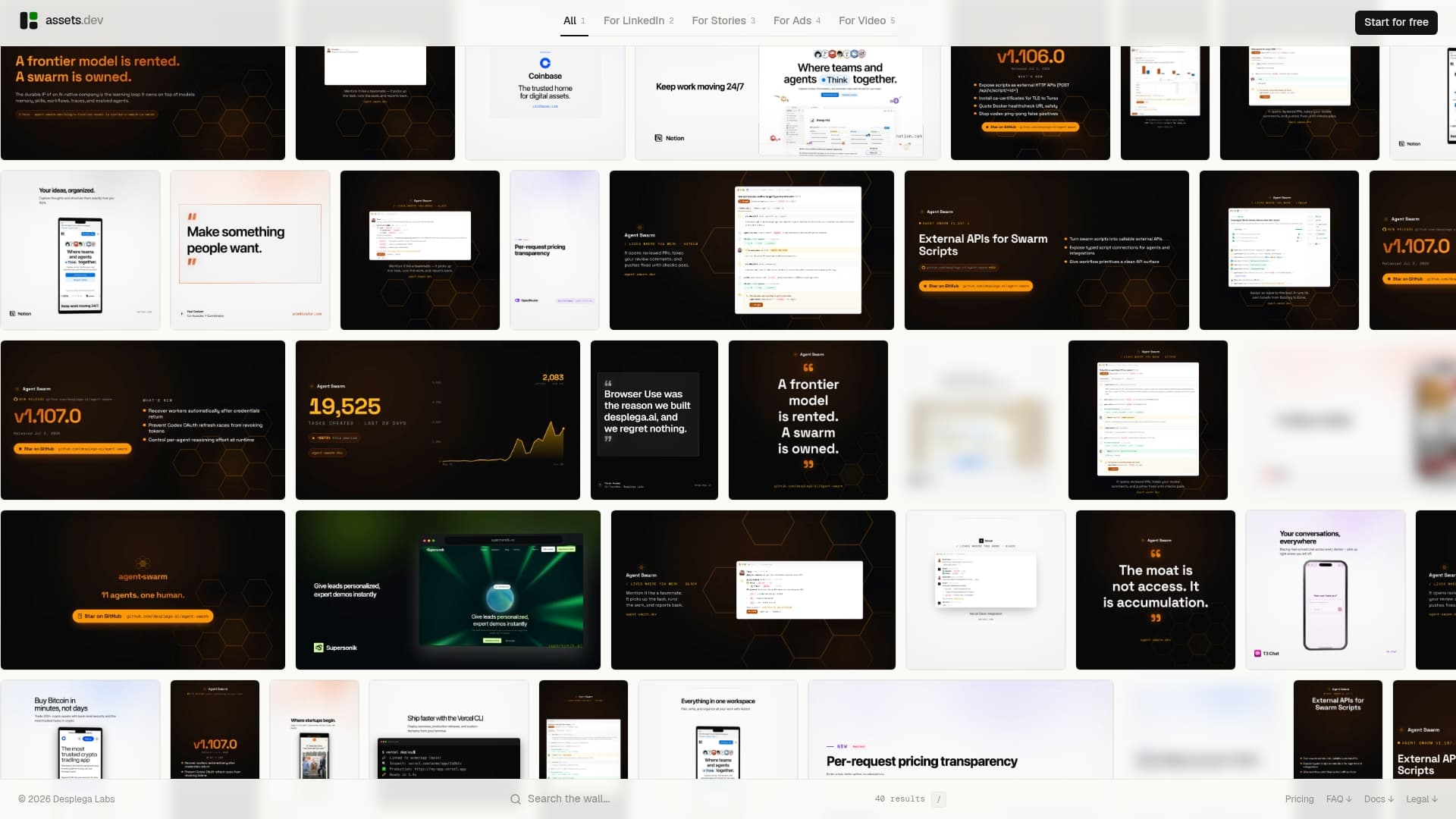
Start on the free plan, no card required, and you get up to 10 video renders or 100 image renders to test testimonial cards, logo strips, and stat callouts across your actual channels. If you outgrow that, you can upgrade to a paid plan for expanded usage. Through July, new accounts get 1,000 credits instead of the usual 100, plenty to build a full library of proof graphics for LinkedIn, Instagram, your website hero, and your ad campaigns in one sitting. Visit the assets dev platform, upload your brand details, and generate your first social proof template today.
Sources
- B2B homepage CTA: how to choose the right CTA | WebManics
- How to write CTAs for B2B — Search Engine Journal
- React Social Proof Panel
FAQ
What Is an Example of Social Proof?
A customer testimonial quote with a name and photo, a logo strip from recognizable clients, or a stat callout with a real, checkable number are all common social proof examples used near CTAs and on pricing pages.
What Are Social Graphics?
Social graphics are any designed visual, images, carousels, short video clips, made for social platforms or web pages; social proof graphics are the subset built specifically to display customer trust signals like reviews, logos, or results.
What Is Social Proof Advertising?
Social proof advertising uses testimonials, review scores, or user-generated content directly inside paid ad creative to reduce skepticism and increase click-through, since pairing a visual proof point with the CTA tends to outperform product-only ad imagery.
What Is Social Proof on Social Media?
On social media, social proof means visible signals, like counts, tags, reposted customer content, or comment sections, that show other people already trust or use a product, which lowers the perceived risk for a new viewer.
How Do I Quickly Create Social Proof Graphics Without a Designer?
Use a template platform like assets dev that learns your brand colors and fonts automatically, then export testimonial cards, stat callouts, or logo strips in the exact size each channel requires.