Field note
LinkedIn Carousel Size in 2026: The Specs That Work
Discover the ideal LinkedIn carousel size for 2026 to maximize engagement. Learn essential specs for stunning, mobile-friendly designs.

Use 1080 × 1350 pixels (4:5 portrait) for most LinkedIn carousels in 2026. It fills more of the mobile feed than a square post. If you're repurposing the same slides for Instagram or need a safer fallback, build at 1080 × 1080 pixels (1:1) instead. Either way, export the final file as a PDF, ideally PDF/A or PDF 1.4+, with fonts fully embedded and the color profile set to sRGB. That single export rule prevents the two most common failures: substituted fonts and washed-out colors after upload.
A few things to lock in before you open your design tool:
- Pick one aspect ratio and use it on every slide. LinkedIn reads the first page and forces the rest of the document to match.
- Build for 7 to 10 slides. That's the range where completion rates tend to hold up best.
- Keep individual slides light. Aim for well under 10 MB per slide so the whole document stays fast to load on mobile.
Key Takeaways
The right LinkedIn carousel in 2026 comes down to picking one of two exact pixel sizes and exporting as a font-embedded PDF in sRGB color.
| Point | Details |
|---|---|
| Pick the right dimensions | Use 1080 × 1350 px for mobile-first engagement or 1080 × 1080 px for cross-posting flexibility. |
| Lock the aspect ratio | LinkedIn applies the first slide's ratio to the entire document, so never mix ratios mid-deck. |
| Export as PDF correctly | Use PDF/A or PDF 1.4+, embed all fonts, and set the color profile to sRGB. |
| Build for 7 to 10 slides | Completion rates tend to drop once a carousel runs past 10 to 12 slides. |
| Use templates to save time | assets.dev offers pre-sized templates and export presets built for these exact specs. |
Table of Contents
- What Is the Ideal LinkedIn Carousel Size in 2026?
- How Should You Design Slides for Mobile Legibility?
- What Is the Export Workflow for a LinkedIn-Ready PDF?
- What Happens When You Upload a Document to LinkedIn?
- How Many Slides and Where Should the CTA Go?
- Where Do Ready-Made Templates Fit Into This?
- Why the "Just Post It" Approach to Carousel Sizing Backfires
- Turn These Specs Into a Finished Carousel Today
- Sources
- FAQ
What Is the Ideal LinkedIn Carousel Size in 2026?
The two safe dimensions are 1080 × 1350 px and 1080 × 1080 px, and choosing between them comes down to where the carousel will live. Multiple 2025–2026 platform guides converge on these exact numbers, including Sendible's LinkedIn post size reference, which treats them as the current baseline for document posts.
Portrait format (1080 × 1350, a 4:5 ratio) claims more vertical space in the mobile feed, which is where most LinkedIn traffic happens. Square format (1080 × 1080) trades some of that real estate for flexibility. It's the format to reach for when the same asset needs to run on Instagram or another square-first placement without a redesign.
Landscape carousels (1920 × 1080 or similar wide ratios) still work technically, but they shrink dramatically on a phone screen and tend to underperform for scroll-stopping impact. Save landscape for desktop-heavy audiences or slide decks repurposed from webinars, not standard feed content.
Here's the fuller spec sheet:
| Spec | Recommendation |
|---|---|
| Primary dimensions | 1080 × 1350 px (4:5) or 1080 × 1080 px (1:1) |
| Max overall file size | 100 MB, per LinkedIn's Documents API limits |
| Practical per-slide size | Under 10 MB per slide |
| Max pages | Up to roughly 300, though nobody should approach that |
| File format | PDF (PDF/A or PDF 1.4+) |
| Color space | sRGB |
| Resolution | 150 to 300 DPI for sharp text |
LinkedIn technically allows files up to 100 MB and documents with hundreds of pages, but treating those numbers as targets is a mistake. A 40 MB carousel loads noticeably slower on a train commute than a 6 MB one, and slow loads cost you swipes before anyone reads slide two. The aspect-ratio rule deserves repeating because it trips people up constantly: LinkedIn locks the whole document to whatever ratio the first slide uses, so a portrait cover with square inner slides will render distorted or cropped.
How Should You Design Slides for Mobile Legibility?
Most carousel failures aren't dimension problems, they're typography problems. A headline that looks bold on a 27-inch monitor can turn into a gray smear on a 6-inch phone screen, and LinkedIn's mobile app is where the majority of impressions happen.
For a 1080 × 1350 canvas, practical minimums look like this:
- Headlines: roughly 60 to 90 pt, bold weight, no more than 6 to 8 words
- Body text: roughly 30 to 40 pt, left-aligned, short line lengths
- Captions or footnotes: never smaller than 24 pt, and only for secondary context
Safe margins matter as much as font size. Keep critical text and logos at least 80 to 100 pixels from every edge. LinkedIn's interface overlays reactions, captions, and the "see more" prompt near the bottom of the frame, and text tucked too close to that zone gets visually clipped even when the file itself isn't cropped.
Design discipline beats decoration every time here. One idea per slide. One dominant visual element. A consistent color and type system across all 7 to 10 slides so the carousel reads as a single document, not a mashup of mismatched templates. Contrast matters more than it gets credit for, too: light gray text on white looks elegant on a laptop and disappears on a phone in direct sunlight.
On the portrait versus square decision, let the distribution plan drive it. Konvrt's testing on document carousels found portrait consistently wins on dwell time when the audience is scrolling on mobile. Square only wins when cross-posting convenience outweighs that engagement edge.
If you can't read the headline at that size, your audience won't be able to read it on a phone either.*
What Is the Export Workflow for a LinkedIn-Ready PDF?
Getting from a design file to an upload-ready PDF is mechanical once you've done it a few times, but skipping a step is exactly how fonts get substituted or margins shift after upload.
- Set the canvas to 1080 × 1350 px or 1080 × 1080 px before placing any content, never after.
- Duplicate the first slide to build the rest of the deck so every slide inherits the identical aspect ratio and grid.
- Lock your spacing and margin guides so text doesn't drift slide to slide.
- Embed all fonts, or convert text to outlines if your tool doesn't support embedding cleanly.
- Export as PDF, selecting PDF/A or PDF 1.4+ where the option exists.
- Confirm the color profile is sRGB, not CMYK, before the final export.
- Compress images lightly, aiming for 150 to 300 DPI on text-heavy slides, and check the resulting file size.
- Preview the exported PDF at actual pixel size on a phone before uploading.
Tool-specific notes worth knowing:
- Figma: use the PDF export preset and double-check "embed fonts" is toggled, since Figma sometimes defaults to outlining only headline text.
- Canva: its "PDF Print" export tends to preserve fonts more reliably than "PDF Standard," even though the file is larger.
- PowerPoint: exporting through "Save As > PDF" with the "Best for printing" quality option keeps resolution higher than the quick-share option.
- Google Slides: its native PDF export sometimes rasterizes text on complex layouts, so a manual font check after export is worth the extra minute.
LinkedIn's own publishing guidance recommends converting PPT or DOCX files to PDF before upload rather than uploading the native format directly, specifically to avoid layout shifts that happen during LinkedIn's internal conversion.
What Happens When You Upload a Document to LinkedIn?
LinkedIn reads the aspect ratio of the first page and applies it to the entire file. Mixing a 1:1 cover with 4:5 inner slides doesn't produce a mixed-ratio carousel. It produces a distorted one, since every subsequent page gets forced to match page one.
For teams publishing through the Documents API rather than the manual upload flow, uploaded documents can be reused across both organic posts and ads through an uploadUrl process, which is useful for teams running the same carousel across multiple campaigns. The API documentation also flags versioning changes between releases, so anyone building automated publishing pipelines should check the current API version before assuming old request formats still work.
Common upload issues to catch before you publish, not after:
- Font substitution: happens when fonts weren't embedded; the fix is re-exporting with embedding turned on.
- Cropping: usually traced back to text or logos placed too close to the edge, inside what should be a safe margin.
- Soft or blurry first slides: almost always a compression setting applied too aggressively during export.
Practical per-slide file sizes stay well under the platform's 100 MB ceiling in most real-world guidance, and that gap between the maximum and the recommended range exists for a reason: a document sitting near the limit loads noticeably slower on mobile data, and slower loads mean fewer completed swipes.
Before you hit publish, run a five-point preflight: confirm the aspect ratio on slide one, verify fonts are embedded, preview at actual pixel size on a phone, check image compression didn't blur text, and test the upload in a staging account if you have one.

How Many Slides and Where Should the CTA Go?
Seven to ten slides is the practical sweet spot for a LinkedIn carousel. Go much past 10 to 12 and completion rates start dropping, according to testing compiled by LinkedInPreview on carousel post performance.
Since LinkedIn's standard analytics don't break out slide-by-slide completion the way Instagram Stories do, your CTA placement has to compensate for that blind spot. Put the primary call to action on the final slide, where the readers who made it all the way through are most primed to act. Front-load the actual value in slides one through three so people have a reason to keep swiping past the point where most carousels lose their audience.
A few things to track as engagement proxies since slide-level data isn't available:
- Dwell time on the post overall, which correlates with how many slides people actually viewed.
- Saves, which tend to spike on carousels people intend to reference later.
- Shares and comments, both stronger signals of resonance than raw impressions.
- Click-through rate on the final-slide CTA, if it links out.
Smaller file sizes help here too. A carousel that loads instantly gets more swipes before someone gives up and scrolls past, which is one more reason the per-slide size guidance from earlier isn't just a technical nicety.
Where Do Ready-Made Templates Fit Into This?
Building every carousel from a blank canvas gets old fast, especially for teams publishing several a week. Assets maintains prebuilt templates sized specifically for 1080 × 1350 and 1080 × 1080, with export presets that output PDF/A-compliant files by default, so the embedding and color-profile steps covered above are handled before you ever touch export settings.
The platform also supports CLI, API, and MCP integrations, which matters for teams that generate carousels as part of a larger automated content pipeline rather than one-off manual design work. Its brand-learning feature reads your existing colors, type, and logo placement and applies them automatically across new assets, cutting out the repetitive setup work every new carousel would otherwise need.
What this looks like in practice:
- Pick a pre-sized template instead of setting up a canvas from scratch.
- Let the platform apply your brand's fonts and colors automatically.
- Export directly to a PDF preset built for LinkedIn's aspect-ratio and format rules.
- Trigger the whole flow from a script or automated workflow via API when publishing at scale.
Why the "Just Post It" Approach to Carousel Sizing Backfires
Most of the advice circulating about LinkedIn carousels treats sizing as an afterthought, something to fix if the post underperforms rather than something to get right before it ships. That's backwards. The aspect-ratio rule alone, where LinkedIn locks the entire document to the first slide's ratio, has probably tanked more carousels than bad copy ever has, and it's completely avoidable with a five-minute check before export.
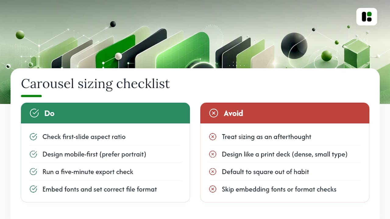
The bigger blind spot is that marketers still design carousels the way they'd design a print deck: dense slides, small type, landscape thinking. Mobile-first isn't a slogan here, it's a measurable outcome. Portrait format claims more feed space and tends to hold attention longer, yet plenty of teams default to square out of habit rather than strategy.
If there's one thing to prioritize over everything else in this article, it's the export step. Dimensions are easy to look up. Fonts silently breaking after upload because nobody embedded them is the failure nobody notices until engagement quietly craters. Get the file format right, and the rest of the specs mostly take care of themselves.
— Desplega Labs
Turn These Specs Into a Finished Carousel Today
Knowing the right dimensions doesn't build the file. If you're tired of resetting canvas sizes, hunting for font-embedding settings, and re-exporting because the color profile came out wrong, that's the exact gap Assets closes: prebuilt templates already sized to 1080 × 1350 and 1080 × 1080, with export presets that hit PDF/A compliance and sRGB color automatically.
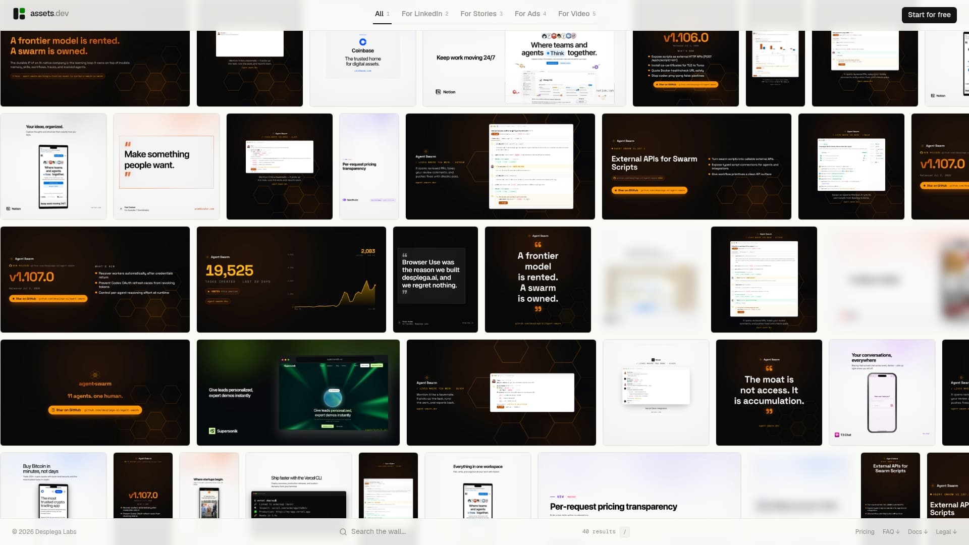
The platform learns your brand's fonts, colors, and layout patterns in seconds, then applies them across every new asset without manual setup. For teams publishing on a schedule, the CLI, API, and MCP hooks mean a carousel can go from brief to export-ready PDF as part of an automated workflow, not a one-off design task. Through July, new signups get 1,000 credits instead of the usual 100, on top of the free plan that already covers up to 10 videos or 100 image renderings with no credit card required. Start a carousel now on the Assets and have your first export-ready PDF before the coffee gets cold.
Sources
For anyone who wants to check these numbers directly, a few primary references cover the technical and practical sides:
- LinkedIn post size: Complete 2026 guide — Sendible
- LinkedIn document carousels: PDF specs that convert — Konvrt
FAQ
What Is the Ideal Size for a LinkedIn Carousel?
The ideal size is 1080 × 1350 pixels (4:5 portrait) for mobile-first engagement, or 1080 × 1080 pixels (1:1) if you plan to reuse the slides on other platforms.
How Do You Make a Carousel on LinkedIn in 2026?
Design your slides in a tool like Figma, Canva, or PowerPoint at 1080 × 1350 or 1080 × 1080 pixels, embed your fonts, export as a PDF (PDF/A or PDF 1.4+), and upload it as a document post. Platforms like assets.dev can generate this file directly from a pre-sized template.
What Are the Typical Sizes for LinkedIn Posts in 2026?
Single images typically run 1200 × 627 pixels for link previews or 1080 × 1080 for square feed images, while document carousels use 1080 × 1350 or 1080 × 1080 pixels.
What Is the Typical Size of a LinkedIn Cover Photo?
A LinkedIn personal profile cover photo runs 1584 × 396 pixels, while a company page cover image uses 1128 × 191 pixels, both distinct from carousel document dimensions.
How Many Slides Should a LinkedIn Carousel Have?
Most carousels perform best between 7 and 10 slides, since completion rates tend to decline once a document runs past 10 to 12 slides.